Guide · Chapter 3
Running a team
A morning briefing rather than a wall of charts: the handful of things that need a decision today, ranked, in plain language.
Most team dashboards make you go and look. This one starts by telling you: six items, highest severity first, each linking straight to the screen that explains it.
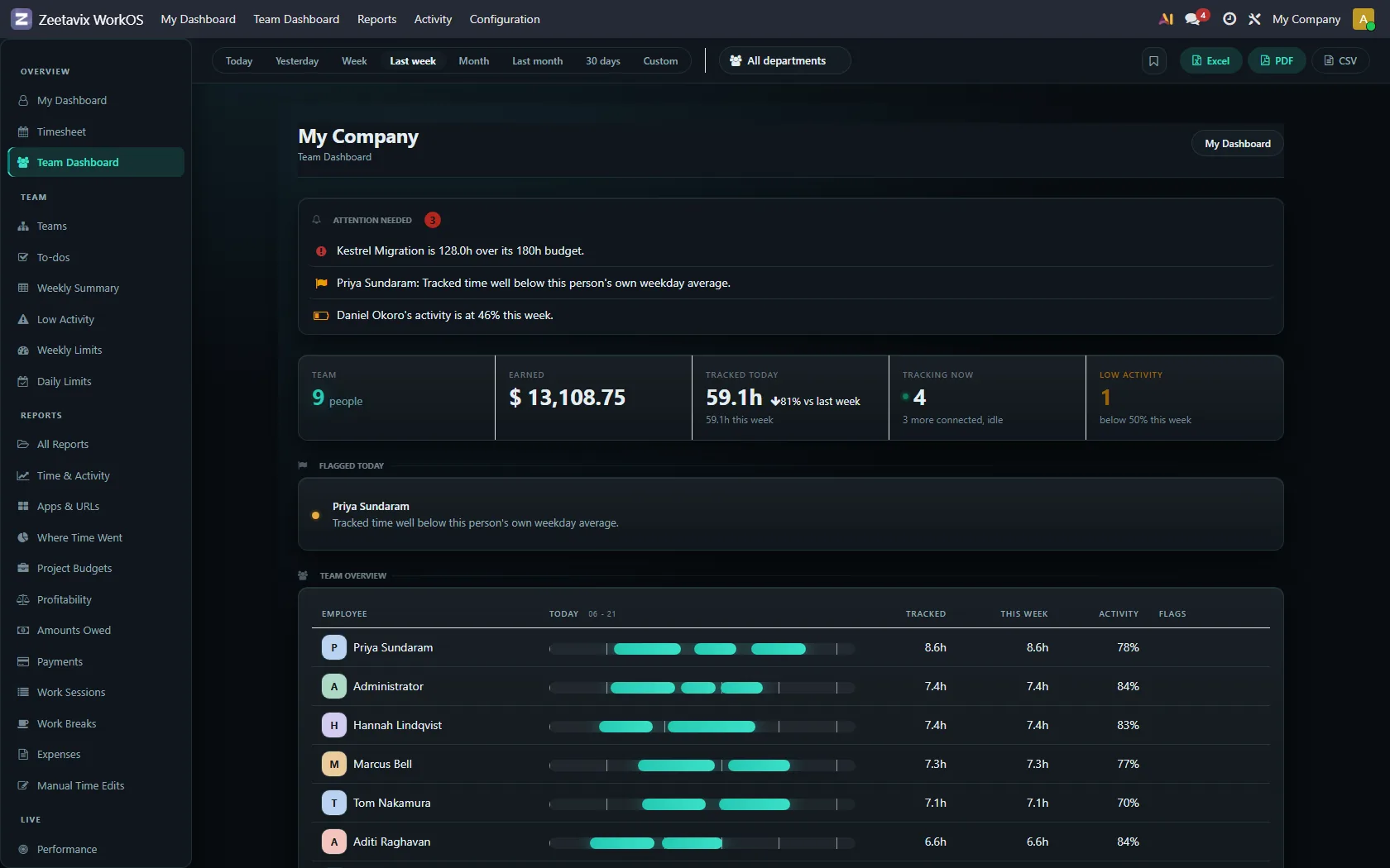
Attention needed
Built entirely from figures the page has already computed — it costs no extra queries and it cannot disagree with the rest of the screen. Three kinds of line appear:
- A project is over its hour budget, with how far over and what the budget was. Only projects that actually have a budget, and only when the overrun is big enough to print.
- Somebody is over their weekly limit, with the hours tracked.
- Somebody’s day is well below their own average. Again: their own, never the team’s.
If people stop trusting the list they stop reading it, and the lines that do matter go unread with the rest. So a project with no budget never appears here, however many hours have gone into it.
The range chips
Today, Yesterday, Week, Last week, Month, Last month, 30 days, Custom. Every report in the product shares this control and the same resolver behind it, so “this week” means the same thing on all of them. The department filter beside it narrows every figure on the page at once.
The team, at a glance
One row per person: their day as a band, hours today, hours this week, activity, and any flags. Two people with the same name get two rows. A list keyed on names loses somebody the day you hire their namesake.
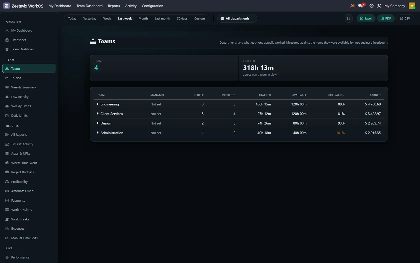
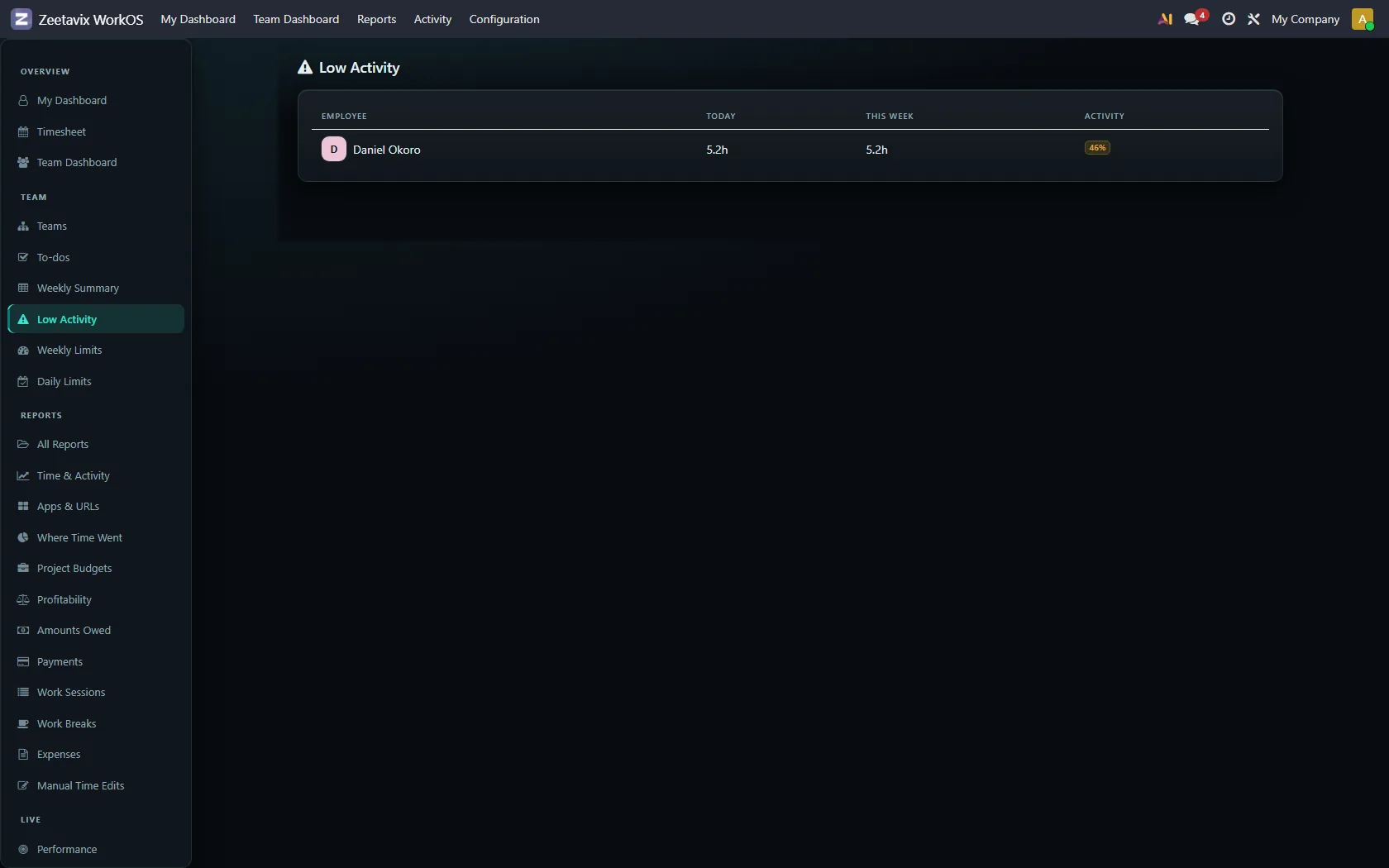
Low activity, and what it is for
The Low Activity screen lists anyone below fifty per cent for the period. Treat it as a list of conversations to have, not people to discipline. A designer staring at Figma and a developer reading code both score badly, and both are working.
How much is on each person
Three more screens watch load rather than output: Weekly Summary, Weekly Limits and Daily Limits. They are covered with their screens in the reports chapter.
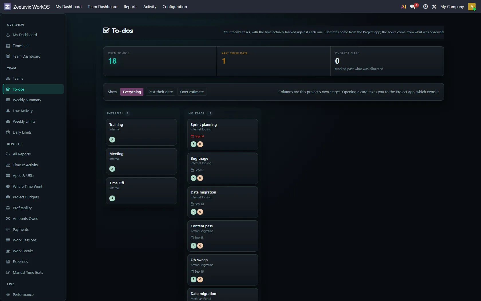
To-dos, as a board
The team’s tasks in columns, with who is on each and how much time has been tracked against it. It reads from Odoo’s own project tasks — this is a view of your existing work, not a second place to keep it.
Insights, and the live screens
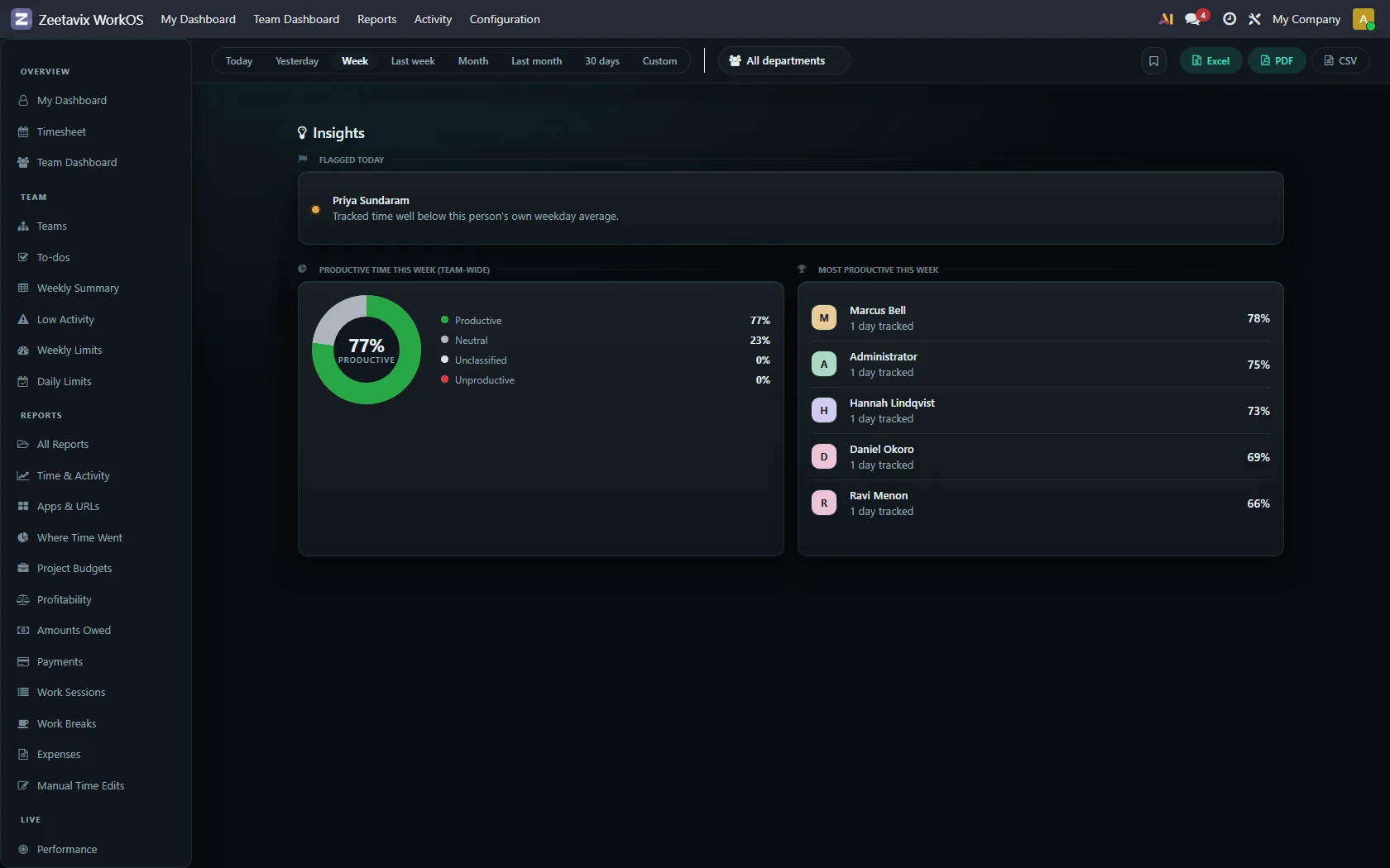
Insights is the week in three parts: who was flagged today, how the team’s time classified overall, and who scored highest. The donut is the same classification you control in chapter seven.
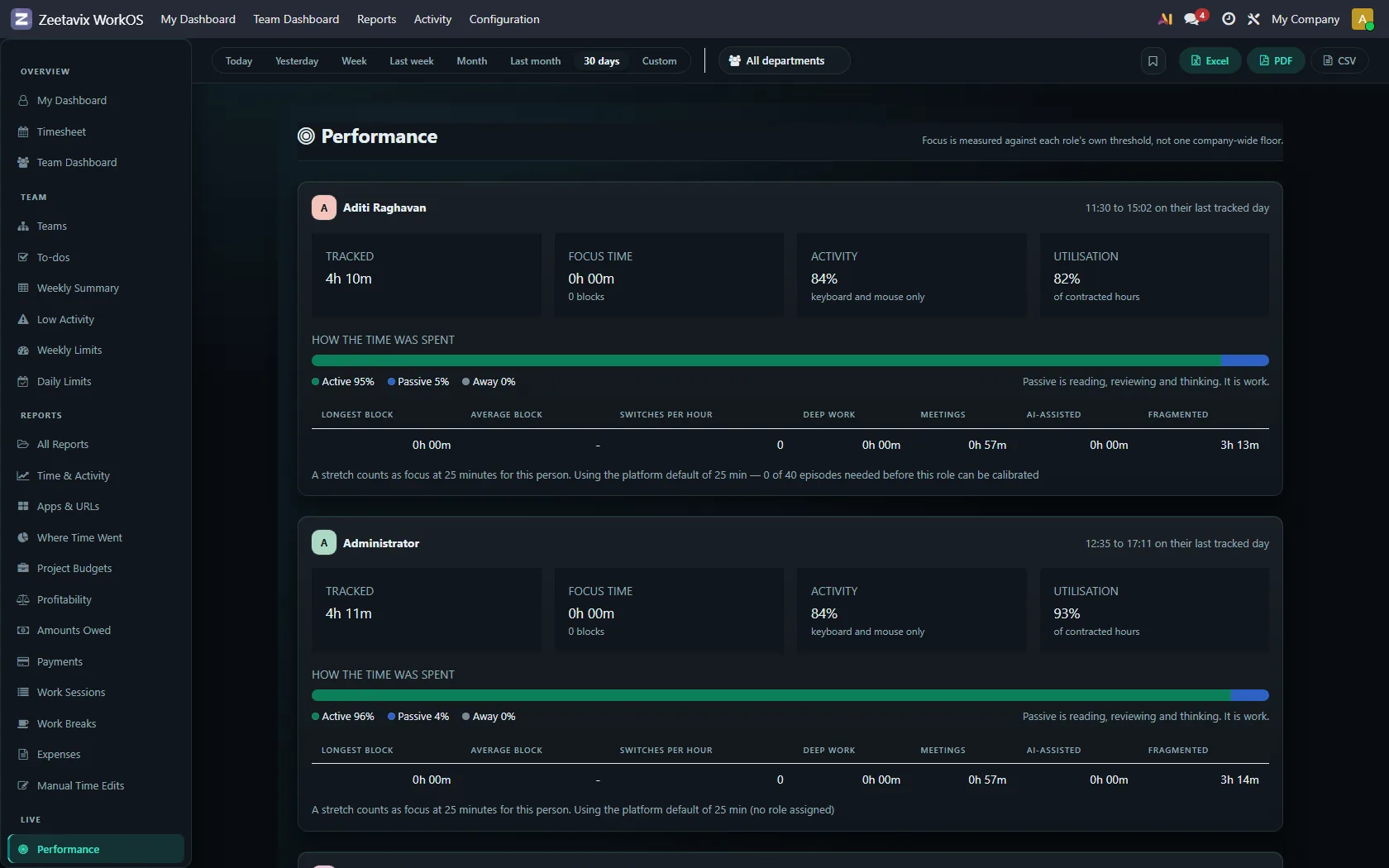
Performance is the live one — it answers “is the product itself keeping up”: how many events arrived, how the queues are doing, and where the time went inside the software. It is a support screen, not a management one.
Exports
Excel, PDF and CSV, top right of every report. Each one rebuilds its columns from the same method the screen uses, so what you can see is what you can export. That includes the money rules in the next chapter but one.